Izicontent-app
Date
September 2025 – February 2026
Type
Individual intern project
Client
Izicontent
My role
User Research, User Experience Design, Interaction Design & Visual Design
Final grade
–
Briefing
Izicontent used an existing application that had become outdated and was no longer compatible with Apple devices. This negatively affected both usability and accessibility for clients. To solve this, Izicontent decided to develop a new solution in the form of a platform-independent web app.
The new web app allows Izicontent’s clients to independently publish news, blogs, products and events on their own websites. This gives clients more control over their content management, while enabling Izicontent to focus more on larger and more complex projects.
The challenge
The main challenge was to redesign an existing app into a modern, future-proof web application that works seamlessly across all devices and platforms, including Apple.
The solution needed to:
Be accessible on desktop, tablet and mobile
Enable clients to manage and publish content independently
Be flexible enough to support new content types in the future
Balance ease of use with enough freedom to create unique content
Goals
The goal of this project was to design a user-friendly web app that empowers Izicontent’s clients to manage their own content efficiently.
Key objectives:
Client independence: clients can independently publish news, blogs, events and products
Flexible content types: new content formats can easily be added when needed
Improved customer satisfaction: both Izicontent’s clients and their end users benefit from up-to-date, professional websites
Increased conversion: a reliable and current website builds trust and supports higher conversion rates
Accessibility & usability: the web app works optimally on all devices and platforms
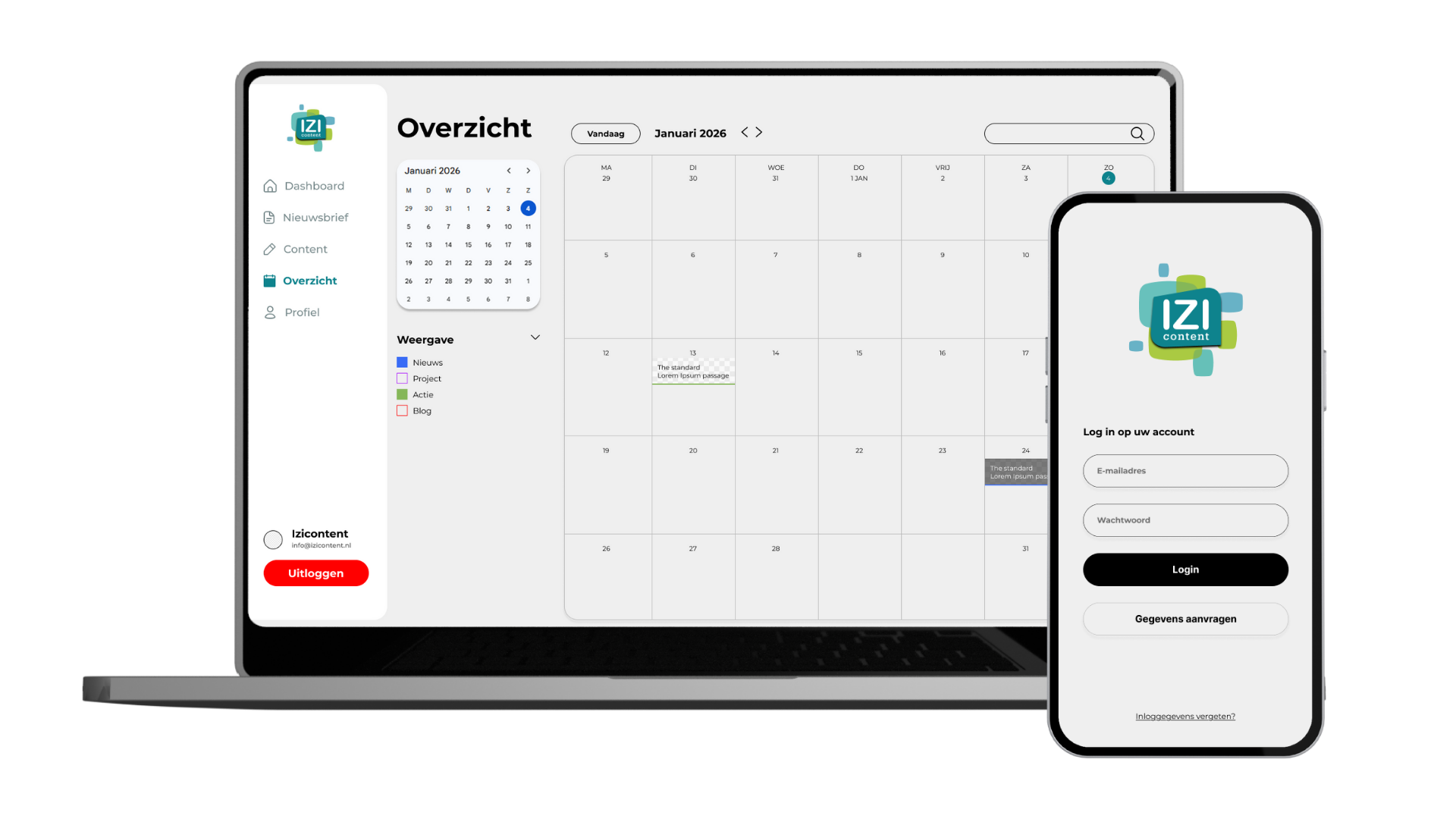
The final deliverable of this project is a high-fidelity prototype that can be further developed by developers.
Process & approach
The project was executed using a combination of planning methods, tailored to different phases of the design process.
Phase 1: Research & definition (Waterfall)
The prepare, research, define and ideate phases followed a waterfall approach. This ensured a structured start, with clear goals, requirements and insights documented before moving into design.
Phase 2: Design & testing (Scrum)
The design phase followed a Scrum approach, consisting of three iterations of two weeks. Each iteration focused on designing, prototyping and testing. This iterative setup allowed for quick adjustments based on feedback from stakeholders.
Research & methods
To understand both user needs and technical constraints, I used a mix of qualitative research and UX methods:
User interviews
Expert interviews
Usability testing
- Card sorting → translated into flowcharts
- Round robin sessions
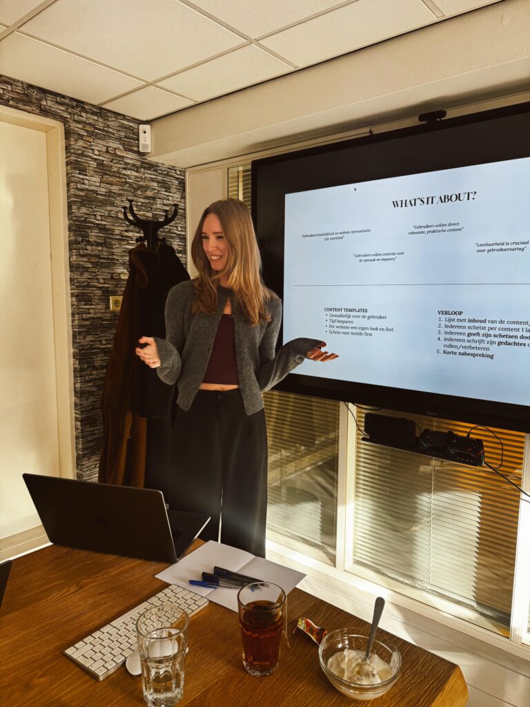
Scenario-based usability tests
Due to limited access to end users, many tests were conducted with colleagues. While this was not the ideal target group, it allowed for frequent validation of flows, navigation and clarity throughout the process.
Key insight
Both the users of the app and the end consumers of the published content value a stable and consistent visual foundation. At the same time, they appreciate occasional variation or unique elements.
This led to a central design principle:
Provide flexible templates that offer consistency by default, with room for customization when needed.
Adjustable templates give users confidence and structure, while still allowing them to create content that feels unique.
Design & prototyping
The design process consisted of three main prototypes, each building on the previous iteration.
Prototype 1: Mobile-first navigation
The first prototype started with hand-drawn sketches of the app. These were translated into a clickable Figma prototype, focusing purely on navigation and overall flow. This prototype was mobile-only and followed a mobile-first approach.
Prototype 2: Functional prototype (mobile & desktop)
In the second iteration, both mobile and desktop versions were designed in Figma. This clickable prototype focused on the core functionalities of the app, such as creating, editing and publishing content.
Prototype 3: Refined & test-ready prototype
The final prototype improved on the second iteration, with refinements based on test results and feedback. This version was prepared for testing by the client, allowing the opdrachtgever to conduct usability tests independently.
My Experience
This project highlighted the importance of balancing structure and flexibility in content management tools. Working solo allowed me to take full control of the UX process, from research to testing and prototyping. Despite limited access to the target audience, continuous testing and iteration helped ensure a clear, usable and future-proof solution.