Internship work
Date
September 2025 – February 2026
Type
Client website designs & redesigns
Client
Izicontent
My role
User Research, User Experience Design, Interaction Design & Visual Design
Collaboration: Close collaboration with designers and developers
Overview
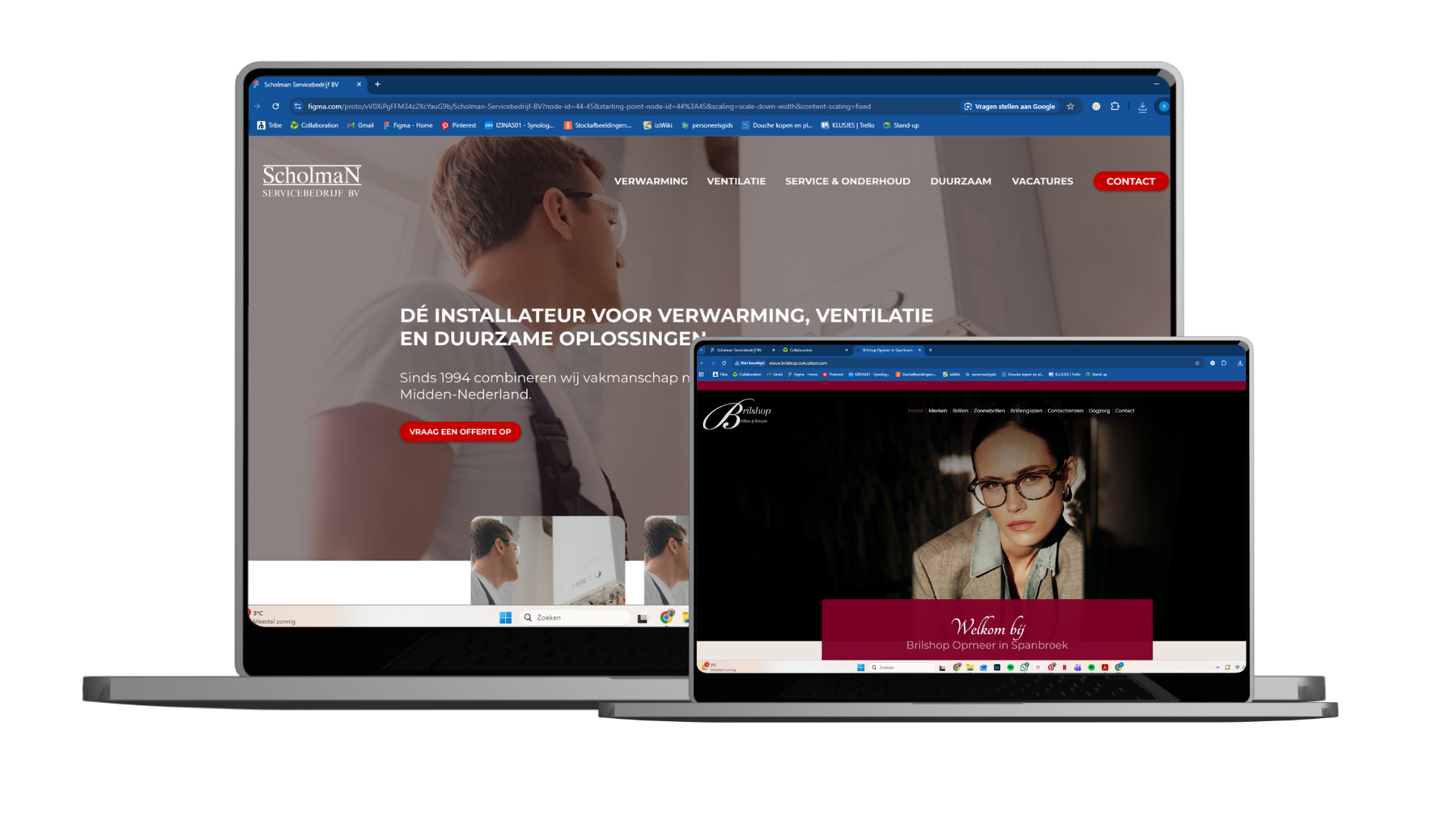
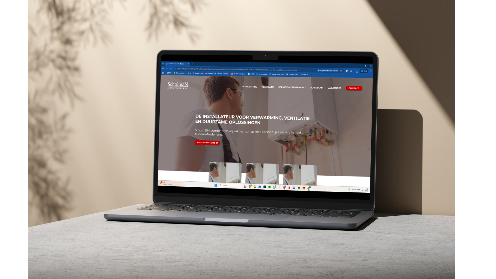
During my internship at Izicontent, I worked on various smaller design assignments alongside a larger main project. These assignments mainly focused on designing or redesigning homepages and websites for different clients across multiple industries.
Although these projects were smaller in scope, they required quick decision-making, close collaboration with colleagues and a strong focus on clarity, hierarchy and visual consistency. Together, they reflect how I work within a fast-paced agency environment and how I translate client wishes into clear, usable designs.
My role & way of working
All projects were carried out in collaboration with colleagues, either through brainstorming sessions or structured feedback moments.
Each assignment usually started with a briefing during the weekly creative meeting on Monday. In this meeting, the client’s wishes, goals and deadline were discussed. Based on this input, I translated ideas into visual concepts, mainly working in Figma. Inspiration came from Pinterest, comparable websites within the same industry and existing client examples.
Instead of spending a long time sketching, I often worked ideas out directly in Figma or in code. This approach fit well with the fast workflow within the company, but also required me to stay critical of my first design choices. Feedback from colleagues and my internship supervisor — mostly given via Figma comments — helped me iteratively improve my designs and reflect more consciously on my decisions.
When starting completely from scratch, I sometimes began with quick sketches before moving on to designing or building the pages using HTML and CSS. Throughout the process, I focused on:
clarity and readability of important content
visual hierarchy
alignment with the client’s desired look & feel
Opmeer Optiek — Homepage redesign (collaboration)
Opmeer Optiek already had an existing website and wanted to refresh their homepage while keeping the familiar style.
Goal
Refresh the homepage without losing the brand identity and recognizable elements, such as the quotes used on the original website.
My contribution
Brainstormed together with a colleague about the new homepage direction
Contributed to the header design
Helped define the updated color palette
During the process, some elements changed due to adjustments in content. This required flexibility and close collaboration, ensuring the final design still aligned with both the original style and the updated needs.
Schippers Optiek — Rapid website redesign
The website of Schippers Optiek was outdated and visually narrow, with little use of imagery. Together, this made the site feel static and less engaging.
Goal
Give the website a more modern and spacious look, without fully changing the existing content. Due to time constraints, the redesign had to be completed within three hours, focusing only on the most impactful improvements.
Key improvements
Full-width layout
The website was expanded from a narrow container to full width, giving the design a more modern feel and allowing images to have more impact.Improved text layout
Long text blocks were split into multiple columns, improving readability and visual balance.Increased use of imagery
Additional images and banners were added to make the site more visually engaging.Subtle visual refinements
Small adjustments to colors, buttons and section spacing improved clarity and navigation.
")
My role
I was responsible for the full redesign and coded all changes myself. The updates were applied directly to the live website, which required careful decision-making and precision.
While coding the layout and visual changes felt natural due to my experience, I asked colleagues for help with the menu implementation, as this was new to me. This project showed my ability to work independently while also recognizing when collaboration leads to a better result.
Reflection
Working on these smaller client projects taught me how to quickly translate briefings into concrete design solutions. Compared to my larger internship project, these assignments required faster iteration, clearer prioritization and close alignment with existing brands.
Together, they demonstrate my ability to:
collaborate effectively with designers and developers
design within tight deadlines
balance usability, visual design and client wishes
work confidently in both design tools and code